7th DubsTech Datathon
DubsTech Datathon 2026

Access to a Livable Planet

Who gets clean air, and who bears the burden of pollution?

Using EPA AQI data, we apply machine learning and data visualization to uncover hidden air quality risk patterns across U.S. counties.

Problem
Persistent regional disparities in air pollution, with climate threats reversing decades of progress
Approach
Machine learning + Data visualizations
📍
Outcome
Classified U.S. counties into 4 air quality types and predicted 2026 high-risk areas
Scroll to explore
1

Analytics & Visualization

Question

How does air quality vary by region?

What we found

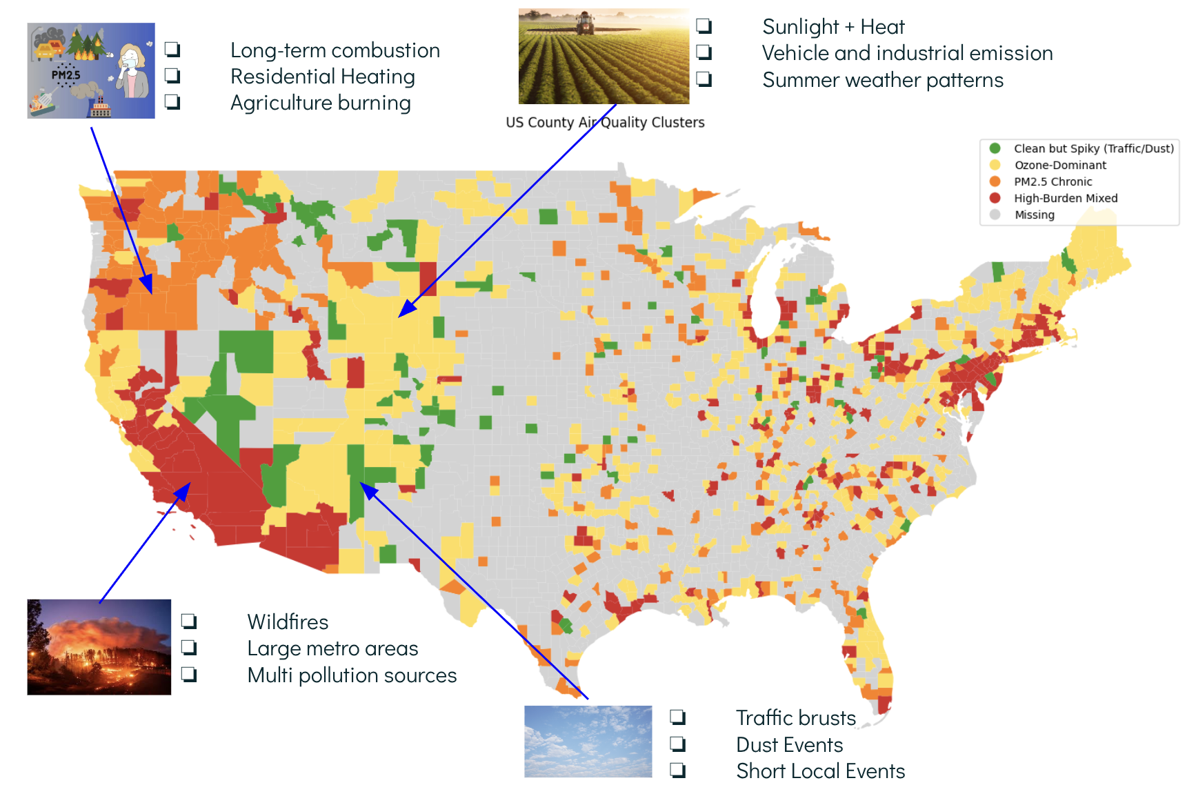
  • Regional Inequity Persists
    Western/coastal counties face consistently higher pollution, while the Midwest achieved near-zero by 2010. Within states, local hotspots remain despite national averages improving.
  • Urban and Industrial Corridors Bear Disproportionate Burden
    Counties with high traffic density (NO₂) and industrial activity (PM2.5) show overlapping pollution exposure. Metro areas and manufacturing hubs experience multi-pollutant challenges that rural regions largely avoid.
  • Federal Policy Delivers, Then Plateaus
    The 1990 Clean Air Act cut unhealthy days by 80%, but post-2015 gains stalled. We've tackled industrial emissions—now face harder challenges like wildfires and agriculture.
  • Climate Threats Reversing Progress
    The West's 2020–2021 wildfire-driven spike shows traditional pollution controls can't address climate-driven air quality challenges. New policy approaches needed.
2

Analytics & Visualization

Question

Visualize trends over time in AQI: identify improving or worsening regions

What we found

  • Overall Improvement Since Clean Air Act Amendments (1990)
    All U.S. regions show significant declines in unhealthy air quality days since 1990, when the Clean Air Act Amendments were implemented. The national average dropped from over 5% unhealthy days in the early 1980s to under 1% by 2025. This demonstrates the effectiveness of federal environmental regulation.
  • Midwest Success Story vs. Persistent Coastal Challenges
    The Midwest achieved near-zero unhealthy days by 2010 and maintained it, while the Northeast and West still hover around 0.5–1%. This gap likely reflects coastal urbanization, traffic density, and (for the West) wildfires—factors requiring targeted interventions.
  • Regional Patterns Reveal Persistent Disparities
    Despite nationwide progress, regional differences remain entrenched. Coastal and western regions face unique pollution sources that federal-level policies alone cannot fully address.
  • Recent Stagnation Raises Concerns
    Post-2015, all regions converge near 0–0.5% unhealthy days, but improvement has slowed. The West's recent uptick (likely from wildfires) suggests climate change may reverse gains in some regions. Current policies designed for industrial pollution may not adequately address new threats like wildfire smoke.
3

Analytics & Visualization

Question

Compare exposure to specific pollutants (PM2.5, Ozone, NO₂) across counties

What we found

  • Ozone is the Most Widespread Threat
    Nationally, ozone exposure days (~150K) far exceed PM2.5 and NO₂, making it the most pervasive air quality challenge. Unlike traffic-related NO₂, ozone affects both urban and rural counties.
  • California and the Midwest Face Multi-Pollutant Burdens
    High-exposure counties (red/orange on map) cluster in California/Southwest (wildfires, urban density) and Midwest industrial corridors. These regions face overlapping PM2.5, ozone, and NO₂ exposure—compounding health risks.
  • County-Level Disparities Reveal Structural Inequity
    The color gradient shows extreme variation: some counties experience 100+ exposure days while others have near-zero. High-exposure areas align with industrial zones, traffic corridors, and wildfire-prone regions—creating systematic environmental disadvantages.
4

Analytics & Visualization

Question

Identify areas at the intersection of high pollution and vulnerable populations

What we found

  • PM2.5 Shows Strong Correlation with Vulnerable Populations
    Counties with high breast cancer mortality are disproportionately exposed to elevated PM2.5 levels. Texas leads with 14 counties facing both risks, followed by Indiana (12), Washington (11), and Ohio (11). This pattern is concentrated in industrial corridors and urban centers.
  • NO₂ Impact is Limited and Urban-Focused
    Only 3 states show overlap between NO₂ exposure and breast cancer mortality (Texas: 6, Georgia: 1, California: 1). This stark difference reflects NO₂'s primary source—traffic emissions—which creates a clear urban-rural divide in exposure patterns.
  • Geographic Inequity Reveals Structural Problems
    The overlap isn't random. High-risk counties cluster in petrochemical regions (Texas Gulf Coast), manufacturing hubs (Midwest), and areas with poor air quality infrastructure. Communities already dealing with cancer are systematically exposed to worse environmental conditions.
  • PM2.5's Broader Sources Make It a Greater Threat
    Unlike NO₂, PM2.5 comes from multiple sources: industrial emissions, wildfires, and vehicle exhaust. This means it affects both urban and rural populations, making it harder to avoid and creating widespread exposure for vulnerable groups.

Machine Learning on County Level Air Quality

To uncover hidden patterns in air quality across U.S. counties and identify future air quality risks, we used K-means and XGBoost algorithms to perform cluster analysis on long-term air quality data and predict the most likely air quality conditions in different regions in 2026. We aim to reveal the underlying geographical, climatic, industrial, and natural factors behind these patterns and help policymakers and community leaders identify high-risk areas and prioritize air purification efforts.

💡 Key Results

  • Evident based annotation on 4 clusters
  • US Map visualization for cluster analysis
  • 2026 Top10% AQI counties prediction 2026

🎮 Interactive Prediction Tool

  • Enter the state and county you are interested in
  • Receive the prediction of 2026 air quality condition
  • Plus the profile and interpretation of cluster

Air Quality Cluster Map

Air Quality Cluster Map
High Burden Mixed
Worst overall air quality and stronger extreme events.
PM2.5 Chronic
Steady, long-term particulate pollution.
Ozone-Dominant
Seasonal ozone-driven pollution.
Clean but Spiky
Mostly clean air with short pollution spikes.
Insufficient Monitoring
Counties without sufficient EPA air quality monitoring coverage.

🤖 Interactive Lookup

Select a county to see its air quality cluster classification and 2026 risk prediction based on long-term pollution patterns.

⚠️ Some counties may not have a 2026 risk prediction due to insufficient data.